Meet the Vice-President who is setting the ‘Pantone’ for the fashion industry
Did you know that the colours you choose to wear and style yourself with, year after year, is actually down to the team at Pantone Colour Institute? They influence designers to use colours they have chosen; in the clothes we end up lusting after.
Vice-President Laurie Pressman is one of many creative minds behind the colour institute. She tells us at Fashion North of how she and her team at Pantone utilize their platform to help others, and lets us in on the science behind the unique colour authority and the impact their work has on the fashion industry.
Pantone are a global company specialising in the creation and distribution of colours. Founded in the 1950s, they are best known for their colour matching system, which is used in a variation of industries, from graphic design to manufacturing, and of course, fashion.
But in the current modern times, Pantone have grown into so much more than what they were originally. Pantone now proudly vocalise their beliefs, and collaborate with other companies to push campaigns, all for the greater good.
View this post on Instagram
Leading the business and creative strategy is the Vice-President of Pantone Colour Institute and colour expert, Laurie Pressman, who is based in the Pantone Headquarters in Carlstadt, New Jersey, United States.
Photo credit: Laurie Pressman
After graduating from Boston University with an undergraduate degree in marketing and psychology, Laurie then attended New York University and graduated with an MA in psychology. She began her career in the retail sector, specialising in buying, merchandising and product development, before joining Pantone in 2000. She has been Vice-President, since 2008, first for the Fashion, Home, and Interiors department, but now for the Colour Institute.
“More and more brands and causes are turning to the power of colour to communicate their message.” Laurie explains. Pantone themselves, recently launched a brand-new colour named ‘Period’, as part of their campaign in collaboration with Swedish feminine product brand Intimina, to end the stigma towards female menstruation. “At a time of body shaming and so much bullying being done on social media, we wanted to encourage and empower those who menstruate to not feel shame but to instead feel proud of this natural bodily function.”
Choosing their colours, however, isn’t as straight forward as it’s sounds. In fact, there is a long process involved. When it comes to Pantone Colour of The Year, Laurie illustrates the lengths she and her team must go to. “As the Pantone Colour Institute team is out there actively searching for general lifestyle colour trends and new colour influences for our colour trend forecast products, they are also on the lookout for the colour family that they see as ascending and seems to be building in importance across all areas of design.” Popular culture also plays a huge role in this decision making, as Laurie tell us that the entertainment industry, art collections, fashion and lifestyle designs are all considered and explored when it comes to determining their colour choices.
Given Laurie’s expertise in psychology, it’s no surprise that a psychological perspective is considered too. She explains: “The emotional aspect of colour is a large aspect of our decision making. We want to ensure that the colours that we select are reflective of the collective mindset. With colour and context so intertwined there are reasons why a colour family or individual colour comes into prominence when it does, and for the most part the popularity of a colour is symbolic of the age we live in. We also consider the colour name as this too conveys a message. We need to make sure the name of the colour we have chosen is directly in line with the message we are looking to send.”
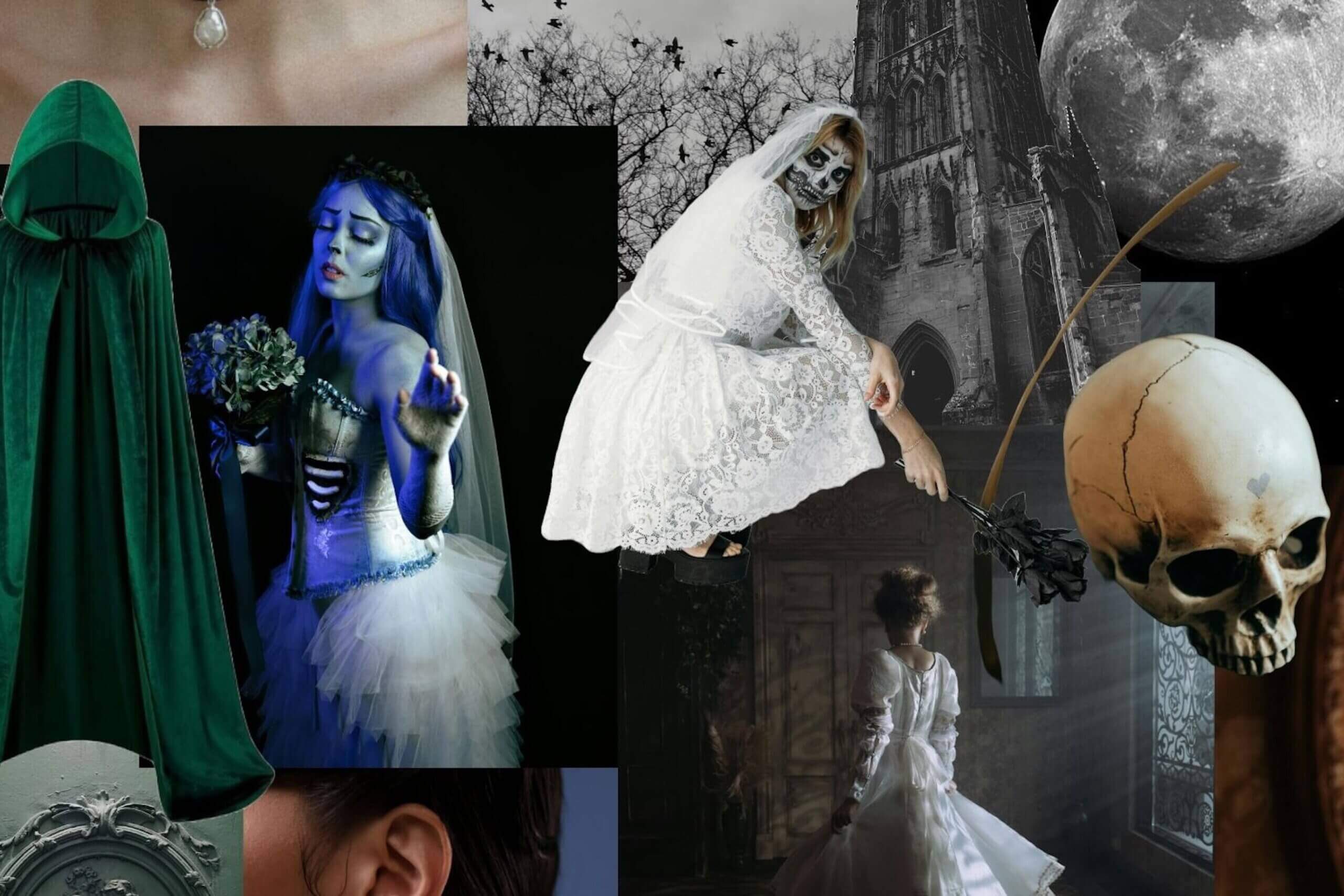
The Pantone Colour of the Year 2020 is ‘Classic Blue’, and we have seen trends including this colour emerge from various designers such as Chanel and Balenciaga. Colours are one of the most important factors in the fashion industry, alongside cuts and silhouettes, when it comes to designing and styling. This timeless shade ‘Classic Blue’ represents confidence but also a sense of calm too, which after the year we have had is definitely needed. However, it won’t be long until Pantone announce their colour for 2021, and ‘Classic Blue’ will be yesterday’s news. In recent years, previous colours of the year have included 2019’s ‘Living Coral’, 2018’s ‘Ultra Violet’ and 2017’s ‘Greenery’. All of which have inspired us not only in a fashion context, but also in other items we purchase, such as home furnishing and other lifestyle products.
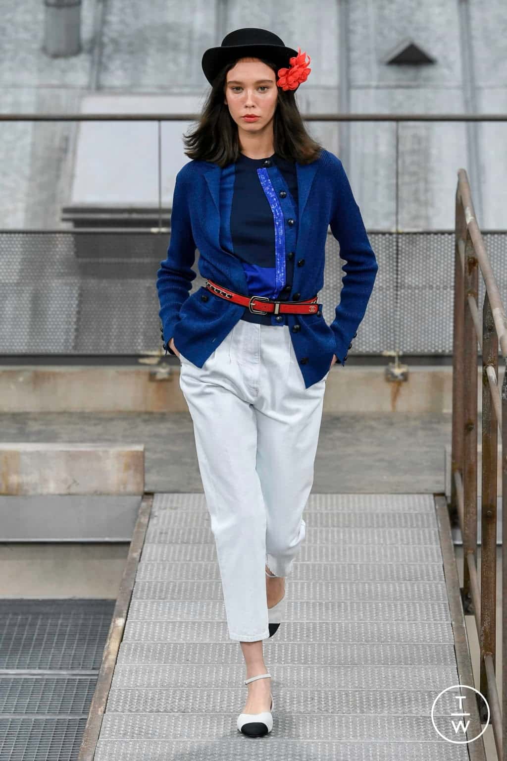
Photo credit: Tag-walk.com
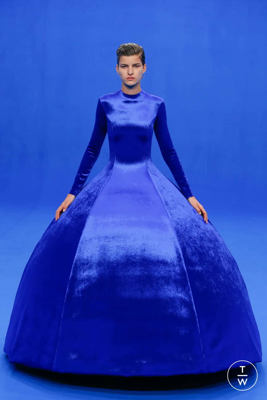
Photo credit: Tag-walk.com
When asked on her opinion on the impact and effect Pantone has on the fashion industry, Laurie responds: “We consider ourselves to be a partner to the fashion industry. Our primary role is to provide a language of colour in both relevant digital and material formats that can be used internationally to select, communicate, and control colour choices, thereby helping bring a designers vision to life. Our products help designers manage colour expectations, accelerate product speed to market, reduce time and material waste and inefficiencies, all of which positively effect time and the impact on the planet.”